Design has the ability to "do good" in many different ways. For a non-profit it can help raise awareness and change peoples' perceptions. This rebranding for the Ocean Conservation Society will update their visual identity in the hopes of helping them continue their quest to preserve the wellness of our oceans.
Through my market research, I came up with the following five words to describe the Ocean Conservation Society: scientific, aquatic, caring knowledgable, and passionate. I used these words as the pillars of our design rebranding.
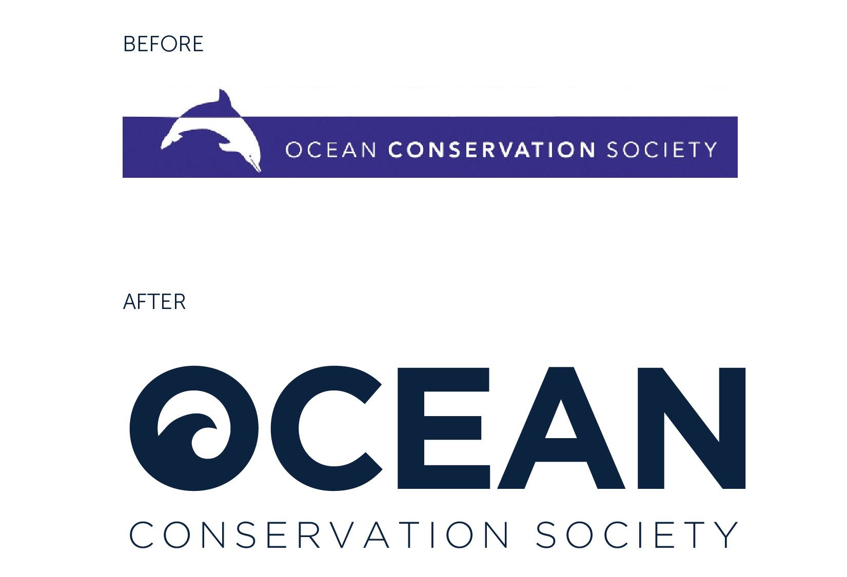
Like the old logo, the new logo sticks with an aquatic theme, but with a clean, modern twist.
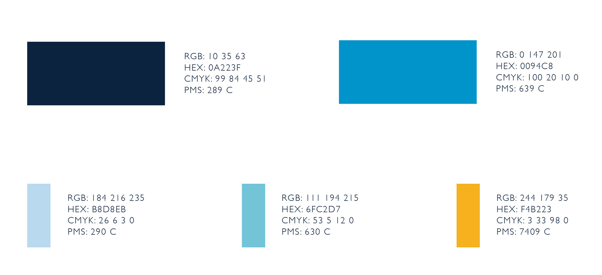
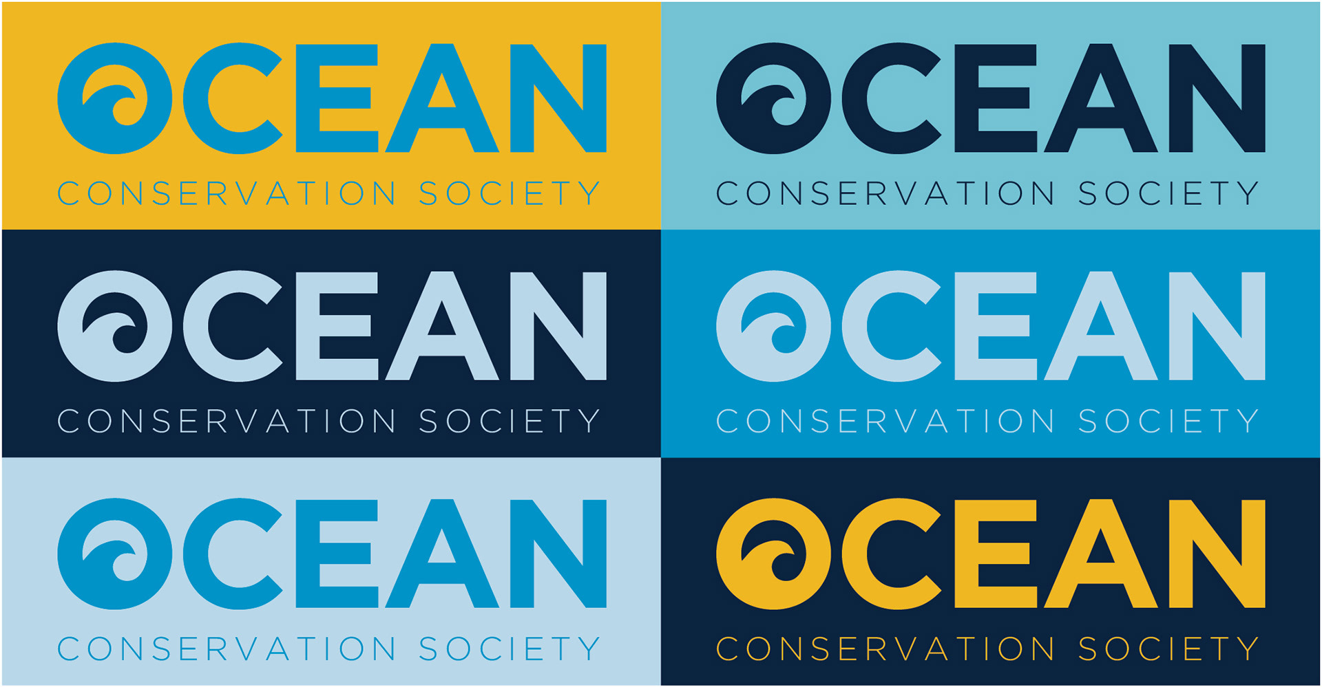
The color scheme follows a nautical theme, with a pop of gold to strategically break up the monochromatic scheme.
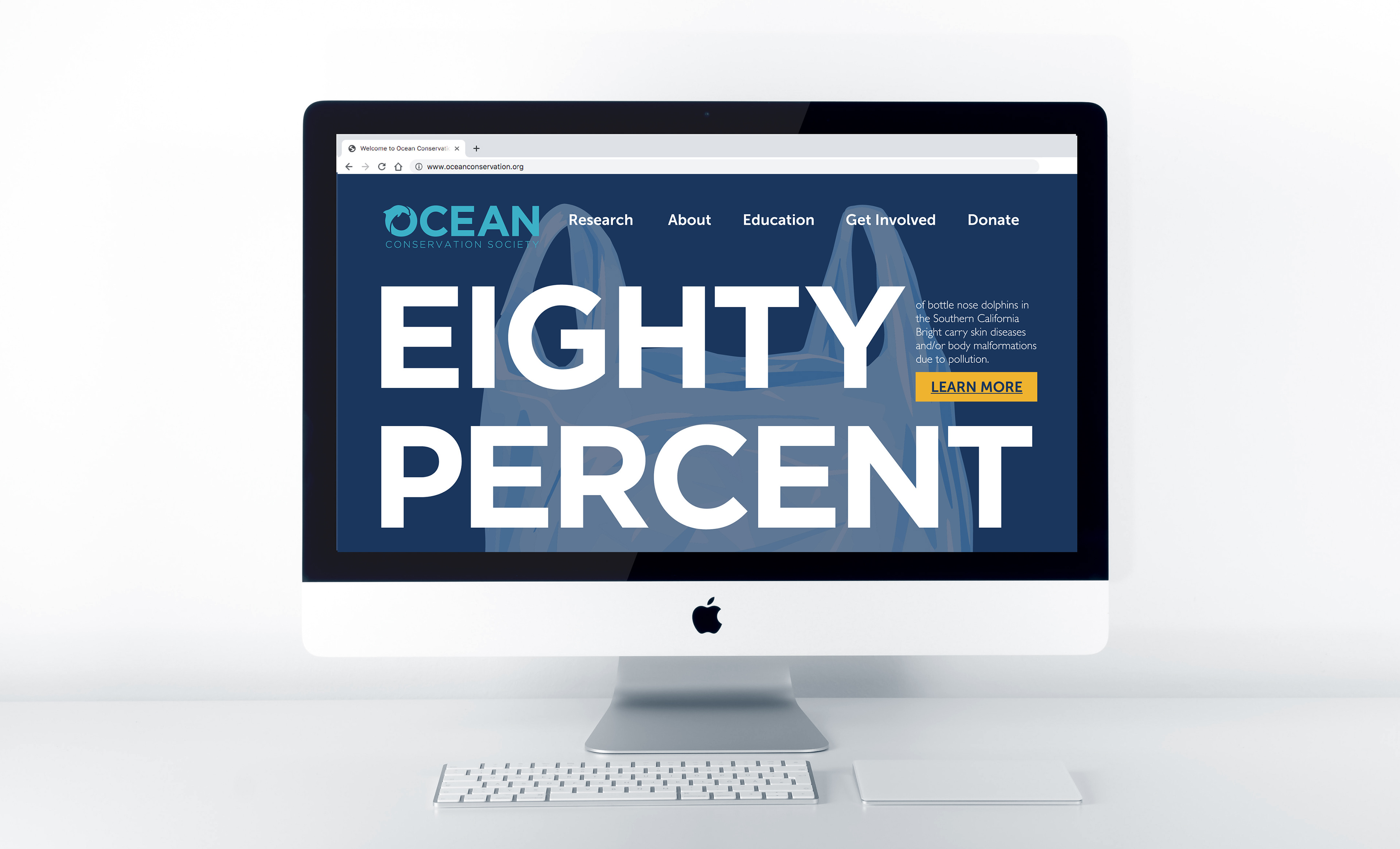
I found this shocking statistic buried within some of the research findings provided by the OCS and I thought it deserved more attention. The percentage is projected in a big, bold font to grab the viewer’s attention and entice the viewer into reading more about the issue. The “learn more” button is displayed with a bright pop of yellow to make it easy for the viewer to see.